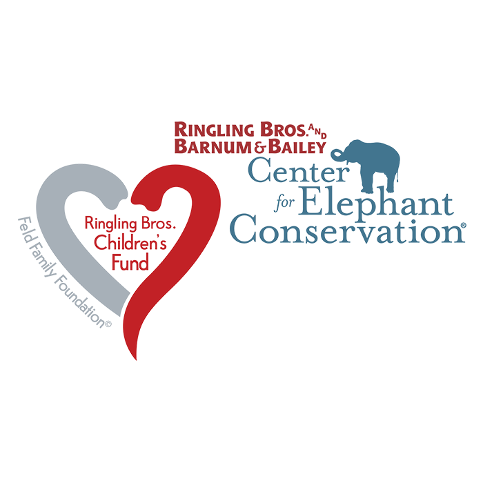
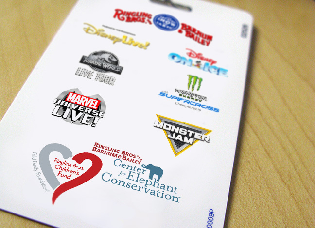
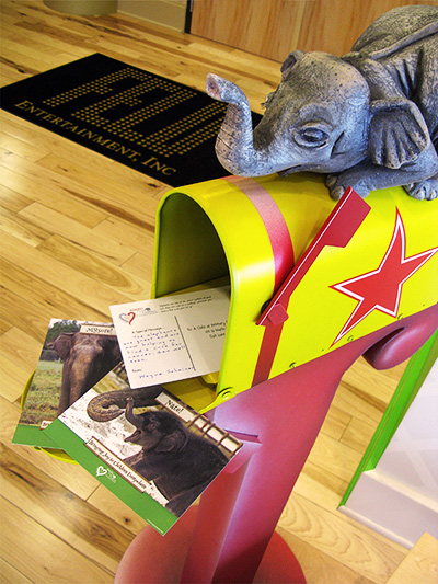
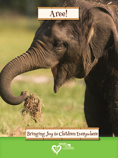
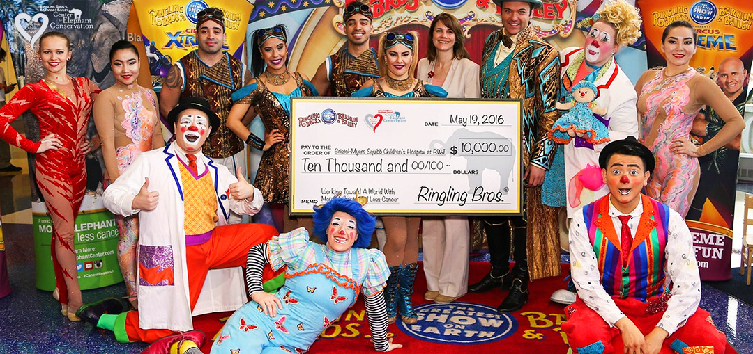
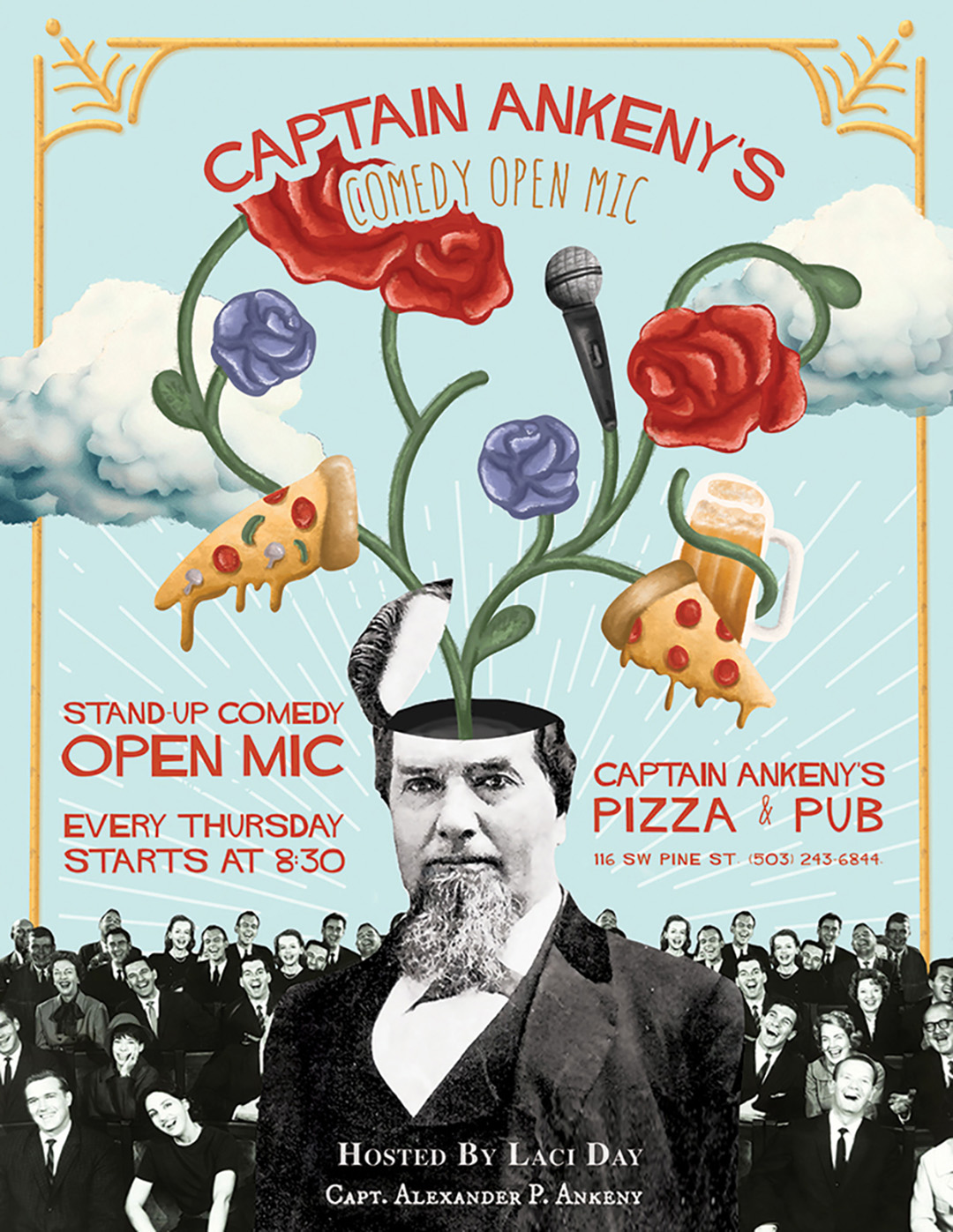
Center for Elephant Conservation, Children’s Fund
Ringling Bros. and Barnum & Bailey | Branding | 2016
In 2015 Ringling Bros. and Barnum & Bailey heralded a new initiative in cancer research with Dr. Schiffman and their host of elephants at the Center for Elephant Conservation. In addition to this new research they created a national children’s fund aimed at bringing joy to children in hospitals. As lead designer I was given the opportunity to work with company leadership on branding identity for the project. I then took this work to create physical assets and unique popup opportunities, in addition to leading designers on their own integration into the project.

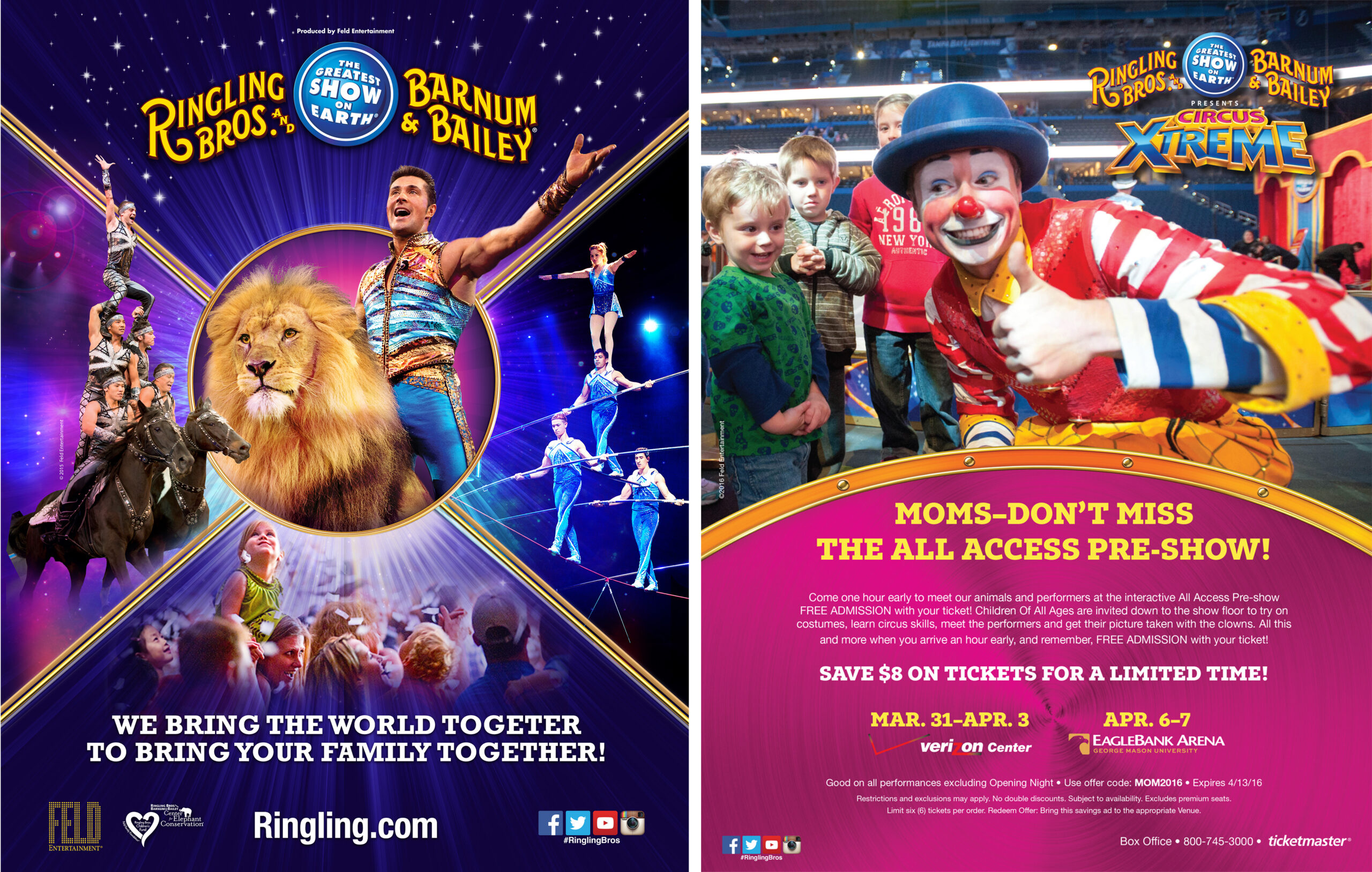
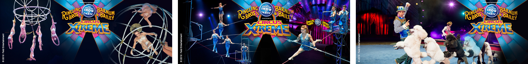
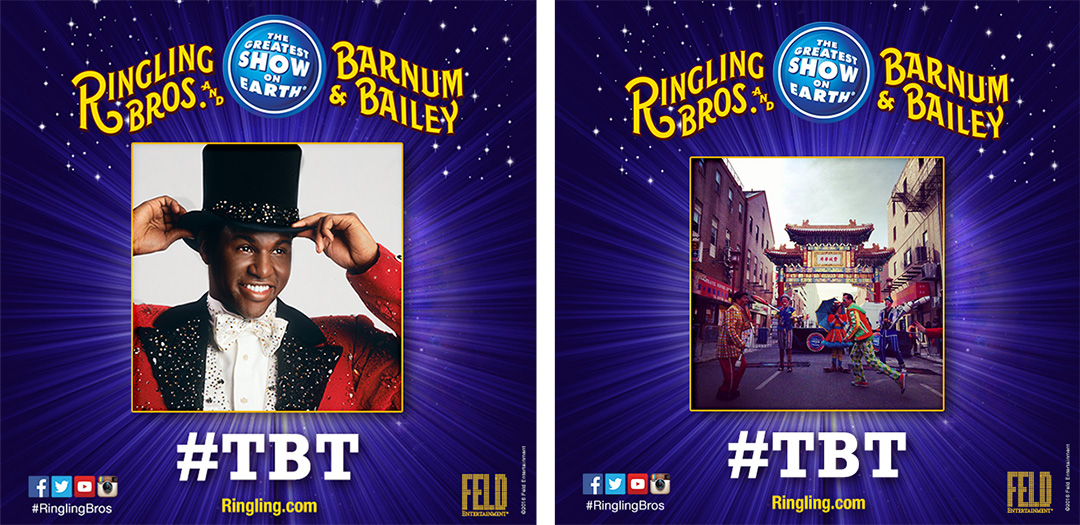
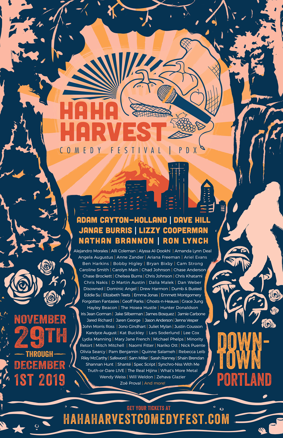
Circus Promotional Materials
Ringling Bros. and Barnum & Bailey | Print & Digital Design | 2016


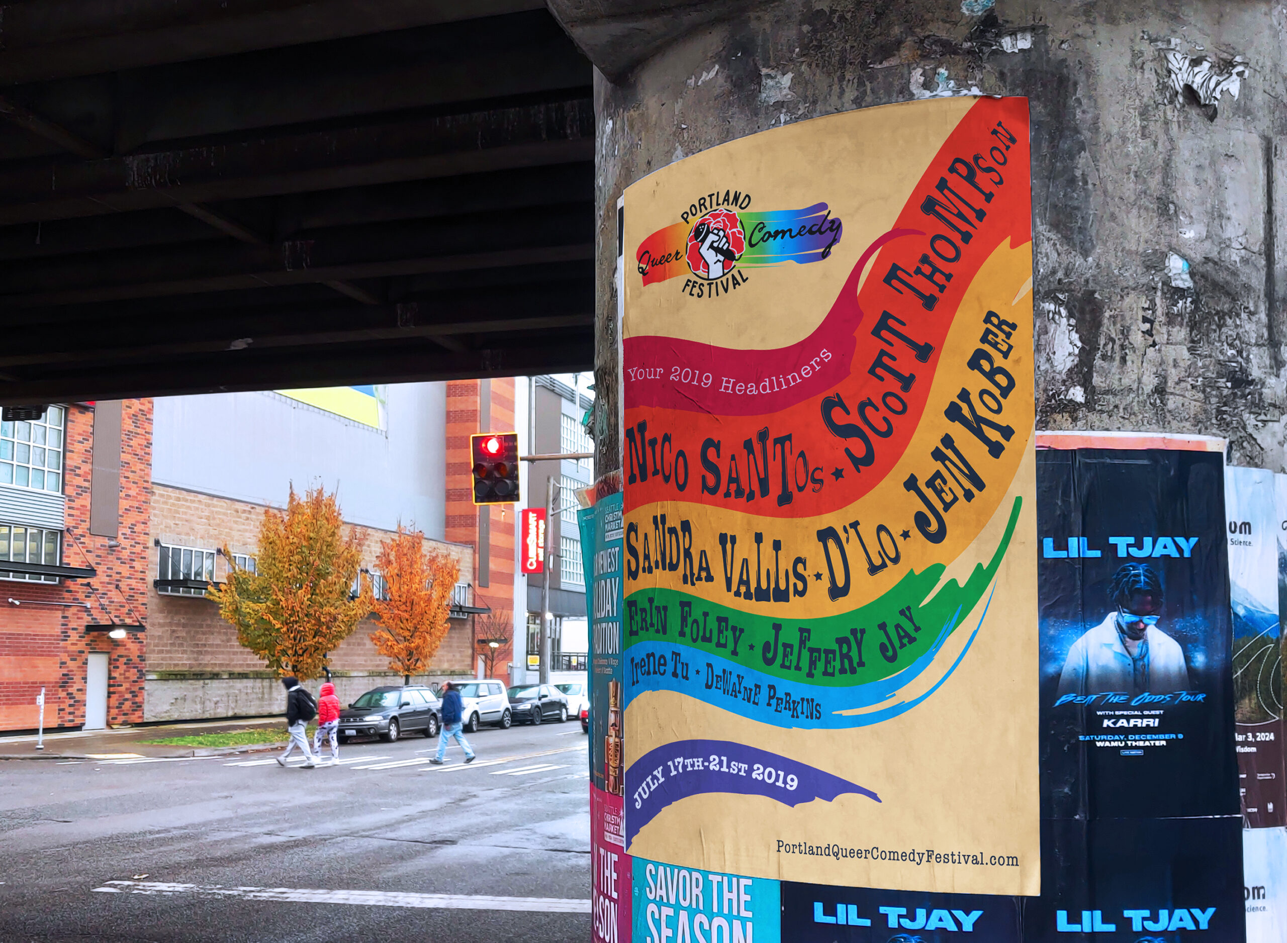
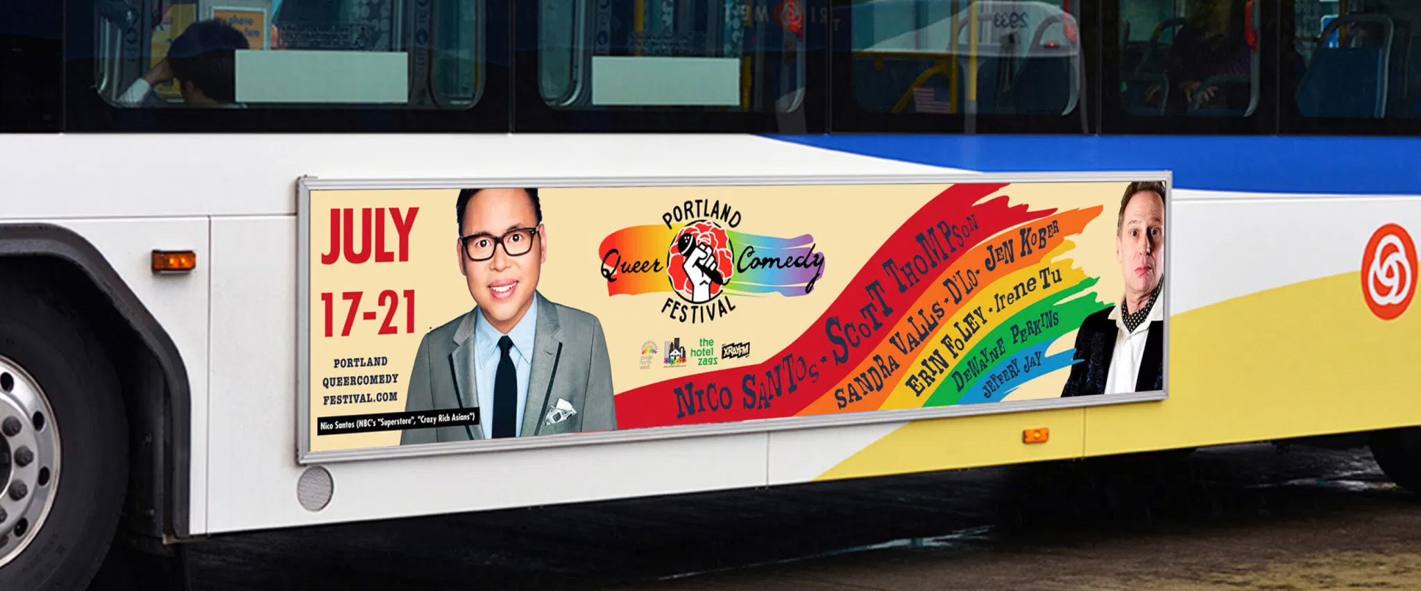
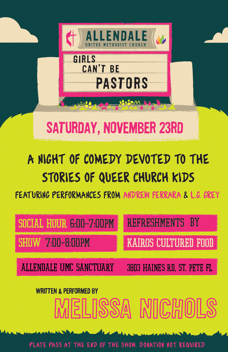
Portland Queer Comedy Festival
Poster & Bus Ad | Print Design | 2019
The Portland Queer Comedy Festival is a treasure in the Pacific Northwest, elevating the funniest and most marginalized voices in the country. I was honored to give back through designing a poster and accompanying Trimet bus ad. To call attention to the history of the queer community, the flag is torn – evocative of 18th century French imagery, and is meant to look towards the revolutionary past and strength of gay and trans pioneers. The type is similarly hand drawn, calling towards the ideas of DIY and underground coalitions.
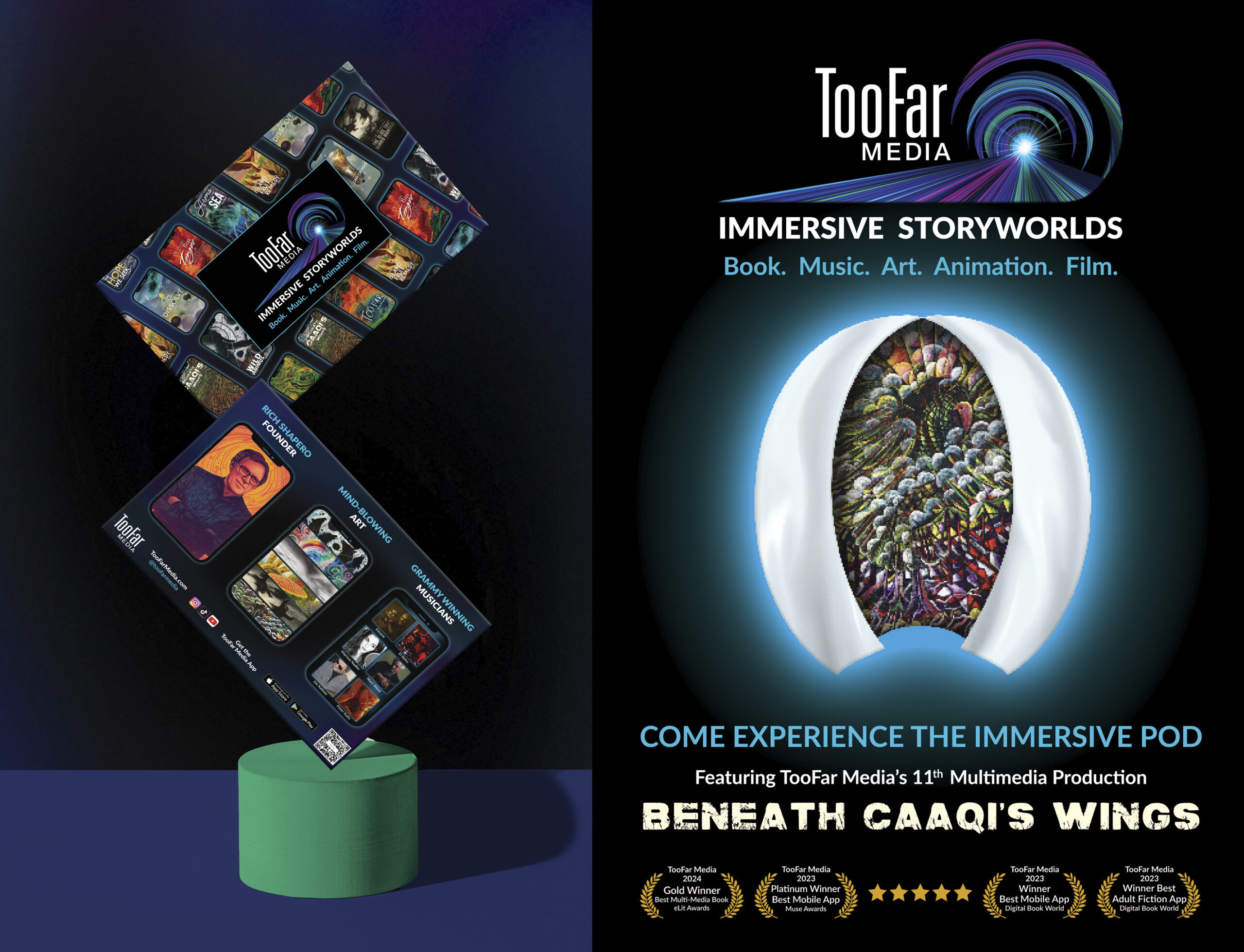
SXSW Australia Creative Industries Expo
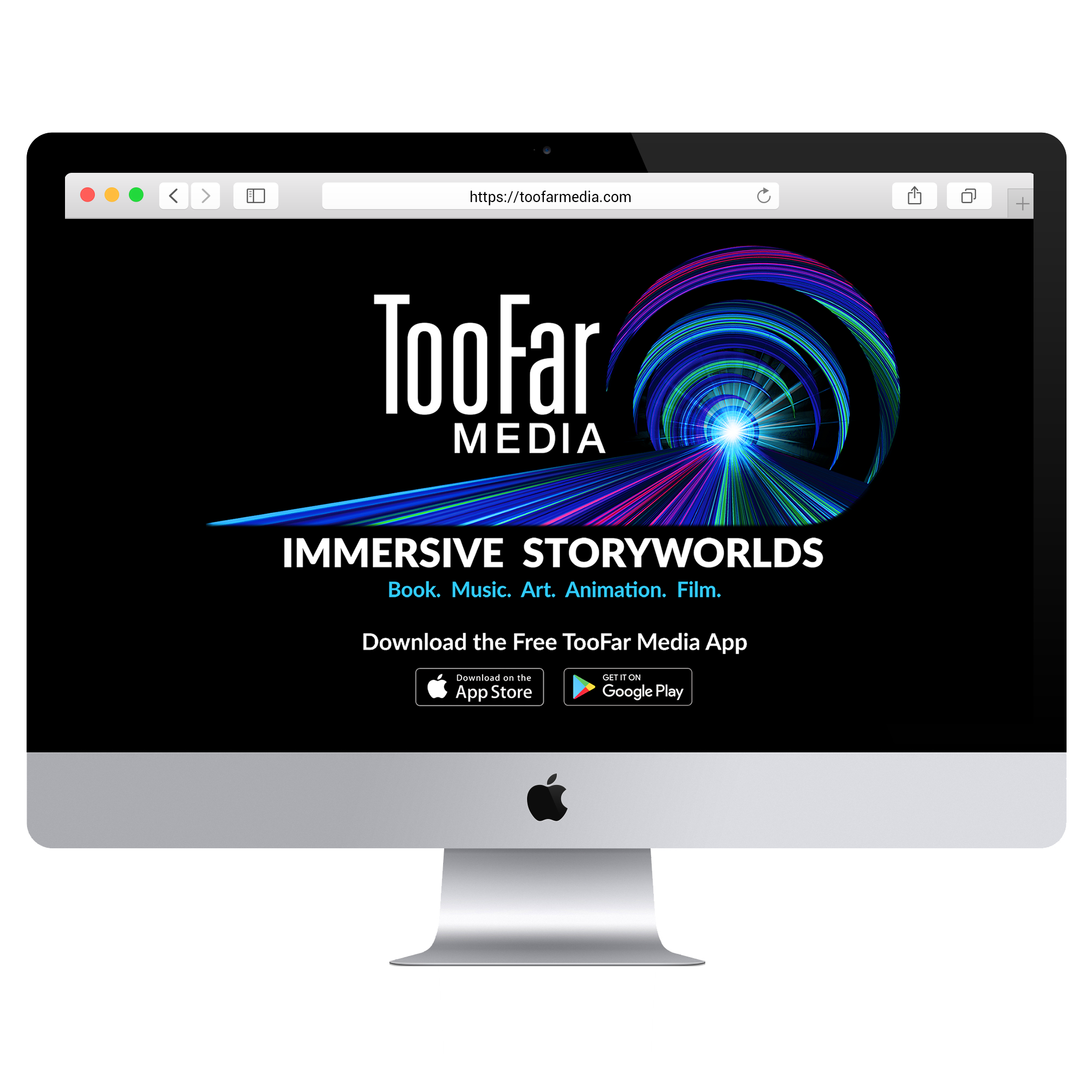
TooFar Media | Experiential Design | 2024
TooFar Media is an award-winning Arts Technology company based in Silicon Valley that creates Immersive Storyworlds which combine Book, Music, Art, Animation and Film.
The SXSW Sydney Creative Industries Expo is a high-level show floor in terms of sizing and opportunity. For the 2023 season I was able to create larger than life graphics meant to pull in people from all sides of the show floor. Working with fabricators in Australia for the custom rounded counter, multi-wall vinyl print, and one of a kind light boxes, I was able to bring my re-imagining of the TooFar Media brand for ‘Beneath Caaqi’s Wings’ into play featuring larger than life art prints and a custom font made by Michael Shaw.


Through Lines
They Might Be Giants | Unofficial Playlist | 2025
*//NOT AN OFFICIAL THEY MIGHT BE GIANTS RELEASE\\*
They Might Be Giants are a Grammy award winning band based in Brooklyn, New York. With a catalogue featuring hundreds of songs, spanning multiple decades, their work is deep well of creativity and eclecticism.
This unofficial, fan playlist exists as a way to curate the listening experience of their music using the themes of work, death, the unknown and so on as navigational through lines.
The visual design for Through Lines the playlist, muses on European folklore concepts to create an otherworldly space where these songs can coexist, if only for a short time. Hand drawn calligraphy and oil painted digital illustrations were used to complement the storybook like feel.
The concept of comparing apples to oranges, much like comparing one song to another, is ironically explored on the slip covers. This time taking things one step further by comparing apples to skulls.
Together the packaging for Through Lines comes together to tell a story easily read but not immediately understood. It creates an atmosphere – a warm, but not necessarily safe, space. It beckons you to come closer. To listen.


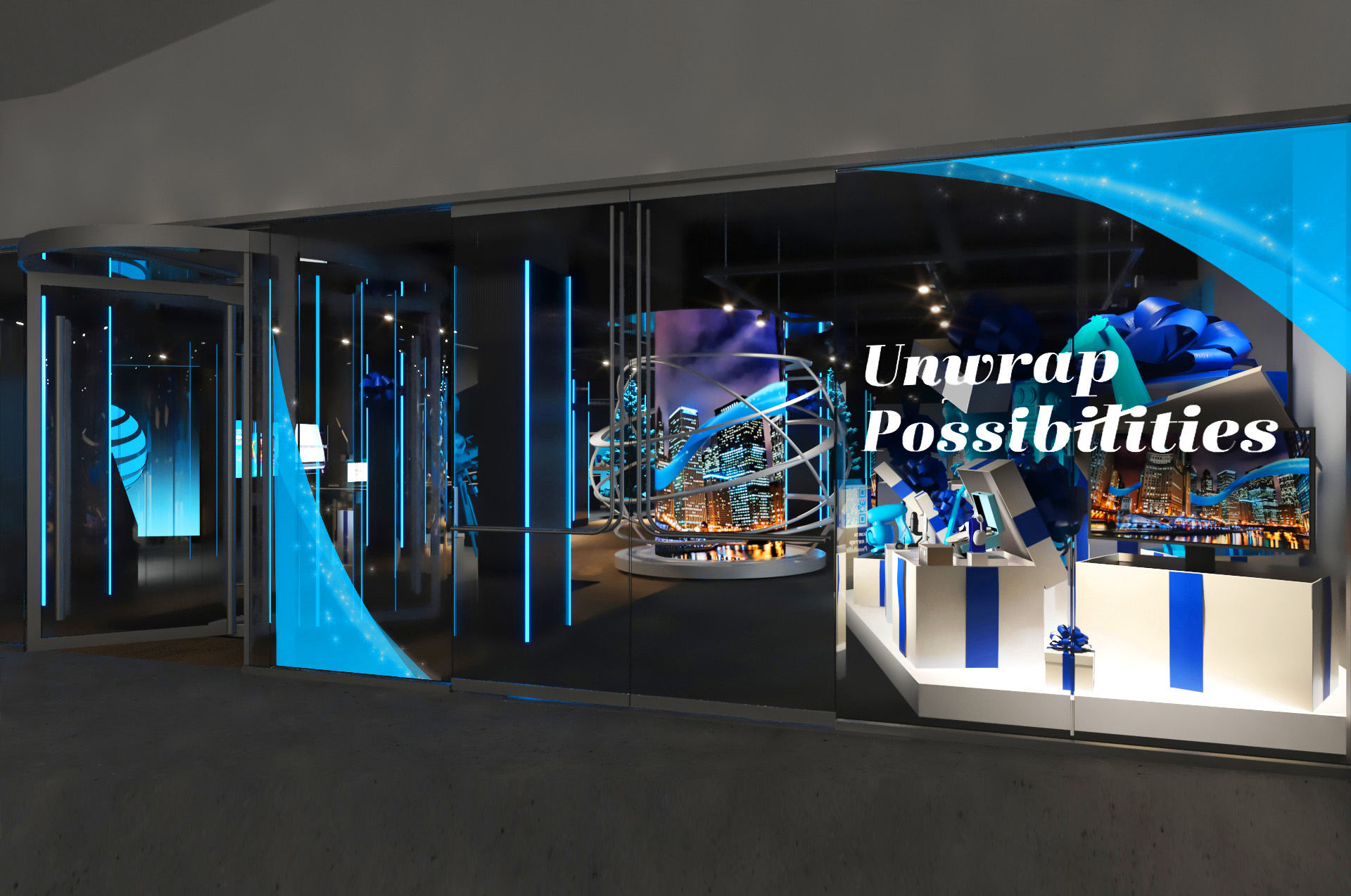
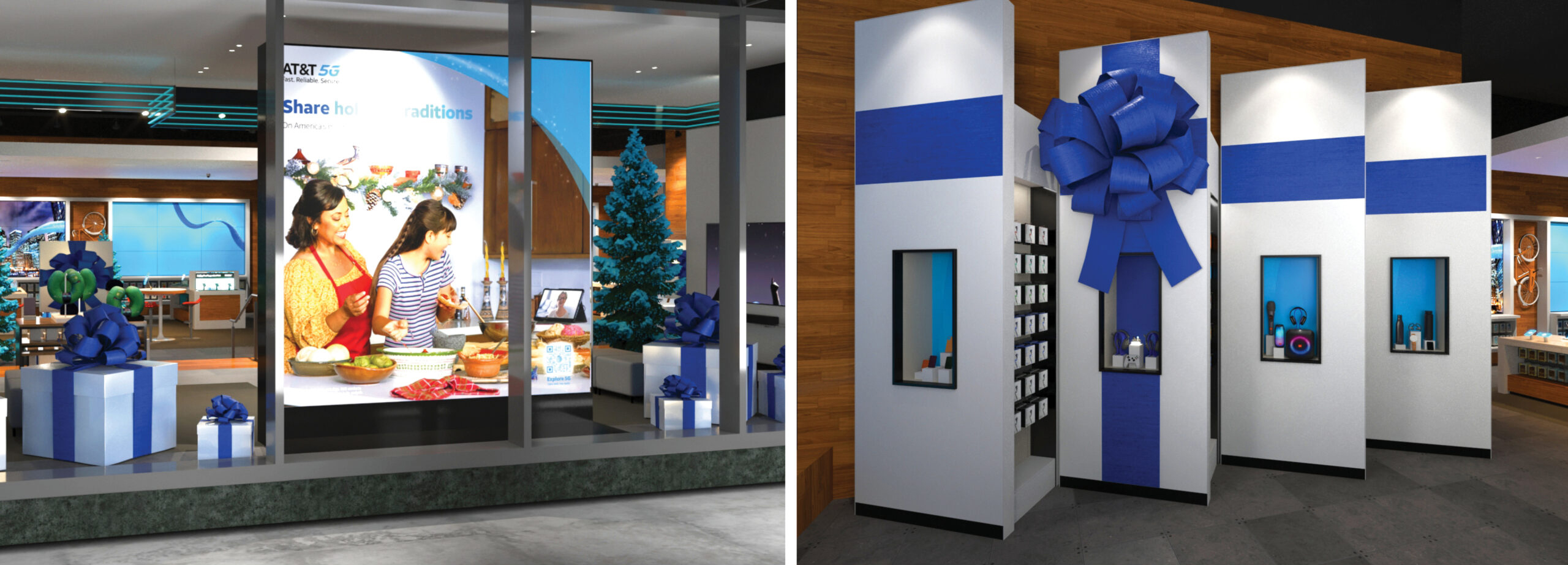
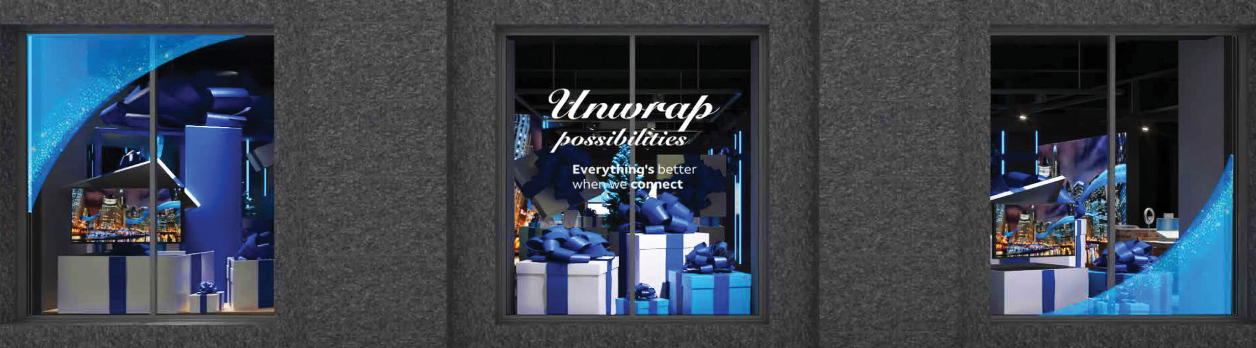
AT&T Holiday Campaign — Flagship Stores
AT&T | Experiential Design | 2022
The 2022 AT&T Flagship Holiday Campaign saw a visual and virtual transformation of their 3 larger than life footprints in Ontario, Dallas and Portland OR. As the designer to create first and last files for these imaginative onsite pieces, I was provided little more than ribbons and flurries, and from there constructed layered designs across multiple applications. Using my experience with leading the CEC project I was then able to collaborate with in-house directors and designers to ensure quality and vision across window fronts, light boxes, set pieces and more.


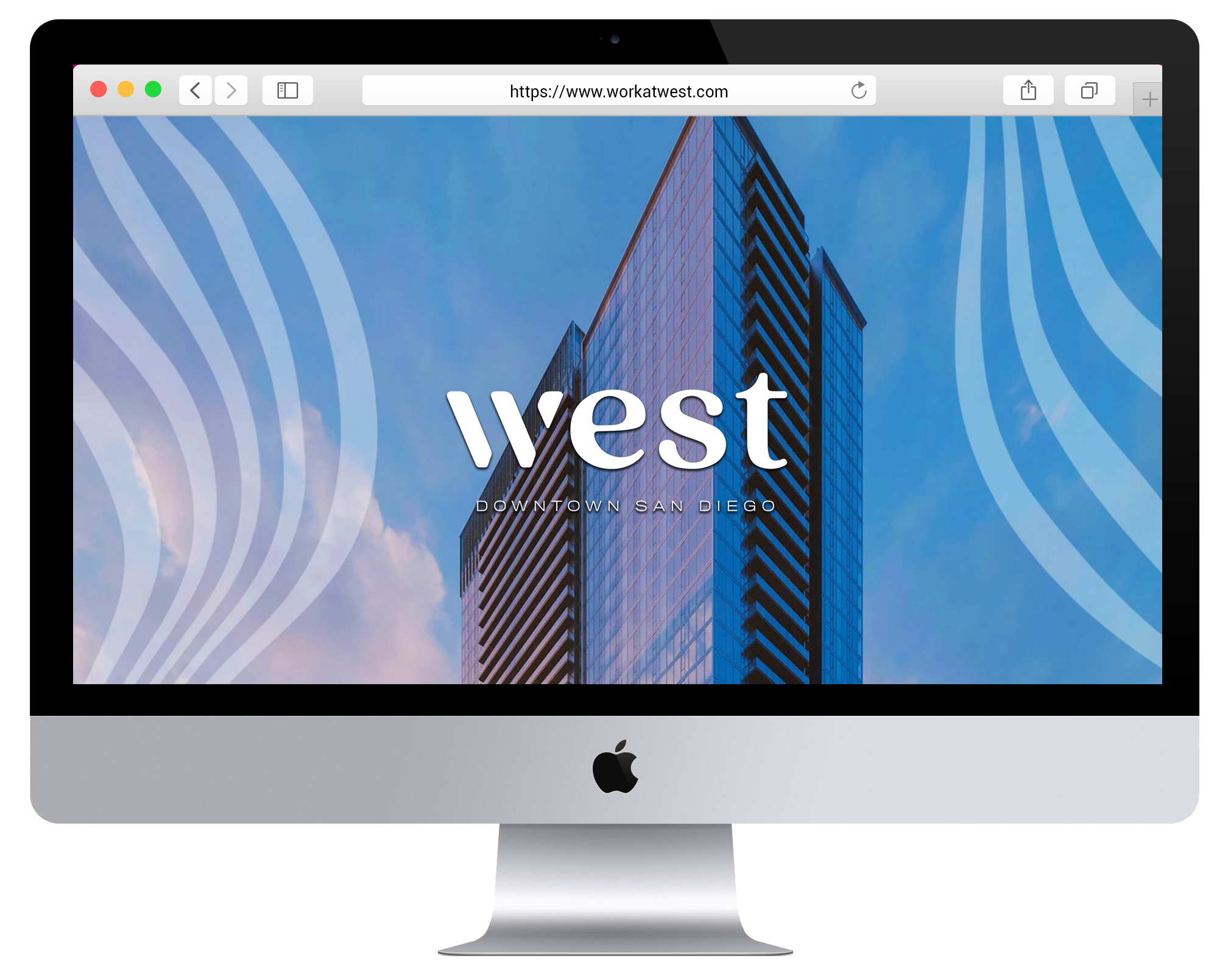
Holland Partner Group | Wix Web Design | 2024
WorkatWest.com is a progressive, forward-thinking website for Holland Partner Groups’ latest residential community in the Pacific Northwest. Filled with personality and warmth, WorkatWest.com reflects the unique visual opportunities offered by the project and location. To honor the larger than life residential space, scale is played with throughout, intermingled with a warm Californian color palette and boho visual accents and modern font choices.
In balancing the need for function vs form I’ve used charming yet elevated page layouts. They are purposefully made easy to read and navigate, offering accessible information which leads to more social sharing. It was important to the client that interactivity be highlighted. To value this note further pages feature a bevy of interactive informative that is color driven and designed for quick access. These elements include segmented galleries, visual and interactive maps, triggerable hover effects, downloadable assets and more.